Heart of Manga
Honest, intelligent news and reviews for manga romantics
Article
The Art of Hana-Kimi – Hisaya Nakajo
June 24, 2011
Following up on last week’s post, I thought I would also review of The Art of Hana-Kimi book. The book was released by Viz in 2008, and features work from the tankoban volumes as well as promotional items that ran in the Hana to Yume publication.
When I first read Hana-Kimi I didn’t think too hard about the artwork. I just enjoyed the story and characters. Besides, most of what I’d seen was black and white anyway. When I received the art book in the mail, you can imagine what a pleasant surprise it was to finally see all these images in color.
I’ve come to appreciate several things about Nakajo’s art style. First of all, most of her pieces are well balanced. The composition of characters and other objects feel well-rounded. Also, the images are not overloaded with details. Simple backgrounds keep the focal point where it should be – on the characters. As well as composition, Nakajo has a good sense of color schemes. Warm palettes, cool palettes, and complimentary contrasts are all evident in her color choices for different pieces.
The book itself is such a treasure trove of works. Not only are there the colored chapter titles, but also the black and white ones shown in sepia. There are the covers of the tankobans, as well as promotional items like phone cards, posters, post cards, and inserts from the drama CDs. The pieces are all arranged in a complimentary layout. There may be several pieces on one page, or one piece taking up a full page, as well as several two page spreads. The book follows the traditional right to left format with all captions translated into English. It’s hardcover bound, so it’s less likely to take any damage you dish at it.
Now to the content. Let me show you some of my favorite pieces!

This one shows Nakajo’s sense of balanced composition. Sano and Mizuki in the foreground are balanced with the white space in the background. The repeating snowflake pattern gives the picture a sense of unity. Nakajo comments in the art book that this is one of her favorite pieces.

These two are good examples of Nakajo’s sense of perspective. Both show her sense of foreshortening using a hand as the closest subject matter. I like the one on the left because of the angle of the image. The one on the right just happens to be my favorite drawing of Sano and Nakatsu as hunky bishies. 🙂

Here are some ideas of Nakajo’s sense of color schemes. Mizuki, on the left, in the school girl uniform hugging a teddy bear – that just conveys warmth, thus her use of a warm color palette. In the center is Sano, suave and reserved giving off that cool aura in a blue color scheme, or cool colored palette. The last one on the right is the Sano brothers. A neutral color palette that shows how Nakajo balances the boys’ hair colors using their wrist bands.

When I first flipped through the book, this piece ended up as one of my favorites. I like the characters in yukata, and the glowing lanterns as well as the fireworks in the background. Nakajo states in the caption that this picture was a request from her editor.

Here are some of the fan favorites for the series. The two main bishies lying in a heap of cherry blossoms on the left. The school doctor, Umeda, lying with his glasses off, on the right. I think both of these show Nakajo’s talent with textures and material. The cherry blossoms in the background of the first really impressed me. As well as the creases of material in the second – it really shows Nakajo’s ability to use a consistent light source for shadows.

Speaking of light and shadows, I feel like this piece is a prime example of Nakajo’s ability to use consistent lighting. Even though each character is split into a different section, the light and shadows are the same for all subjects. I chose this one as well because it is one of the few split compositions included in the book. I like how the uniformity of the black clothing and neutral backgrounds emphasizes each character’s features.

Last, but not least, I’ll include my two favorite images of Sano and Mizuki. I think of this pair as reality vs. fantasy. The first on the left is a good depiction of what these characters would be like in everyday life. Sano is smiling, Mizuki is flashing V for victory, and the two are dressed for field day. The one on the right would be a fantasy of Sano’s. This one makes me laugh every time I see it. Mizuki is seductively naked in an apron pressed up against Sano, and to me, Sano looks shocked because he didn’t realize she was naked until he hugged her. Either that, or he’s having a strong reaction to Mizuki right about then and is worried she’ll notice. 🙂
There are so many more I could include, but I think I’ve put enough here to give you an idea of Nakajo’s artistic talent and how delightful it is to own this collection. Every Hana-Kimi fan should own this, and if you haven’t seen this series, you’re missing out on a very talented mangaka.
Heart of Manga Rating: ♥♥♥♥♥


Super mom and teacher until the kids go to bed, then romance manga addict and writer until the caffeine wears out! Specializes in the shoujo and josei genre of manga and anime.
- Newest Series by Mangaka You Love – Shoujo & Josei - January 3, 2018
- Best New Shoujo Manga of 2017 - December 29, 2017
- Heart of Manga on Hiatus - December 16, 2017
Comments Closed.
- 2017 Live-Action Adaptations from Shoujo and Josei Manga - UPDATED
- Blue Spring Ride Episode 11 - "Like a Storm"
- My Top Ten Male Anime Voices
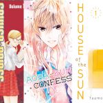
- Review: I've Always Liked You ~Confess Your Love Committee~
- Accidental or Stolen Kiss - Common Shoujo Manga Tropes
- Drama Review: 99 Days with the Superstar
- Devil's Game by Ryo Takagi - BL Feature
- Kamisama Kiss vol 1-4 - Julietta Suzuki
- Drama Review: Oh My Venus
- Until the Full Moon vol. 1 - Sanami Matoh